We’re rebooting our brand with a classic yet powerful color palette. Why? Because in our industry, we’re taking a bold new approach that requires a bold new look to match.
This shift signifies our commitment to transparency and visibility with a sleeker, consolidated palette and modernized fonts. Just like the stark contrast of our colors, we are a distinct voice in our industry. Instead of contributing to the noise, we’d rather get to the point with an image that’s as refined and precise as our products.
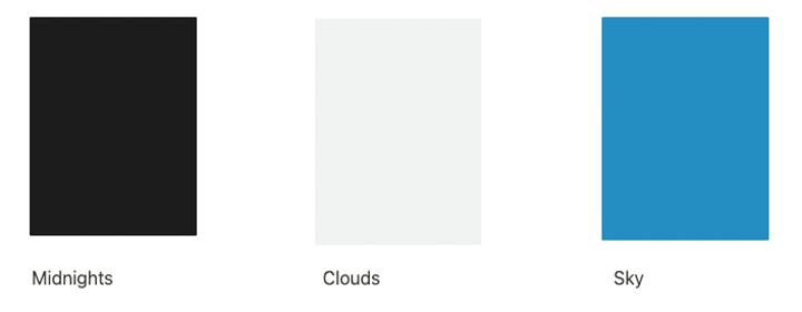
And because we like to have fun, too, our team pitched in with names for our new colors that inspire us to reach greater heights:
Our refreshed brand was built with our team, our customers, and our industry in mind. Current users, don’t worry, your experience across all our solutions will remain the same. You’ll just see our new color palette in place of the old one. See below for an overview of all the exciting updates to our brand:
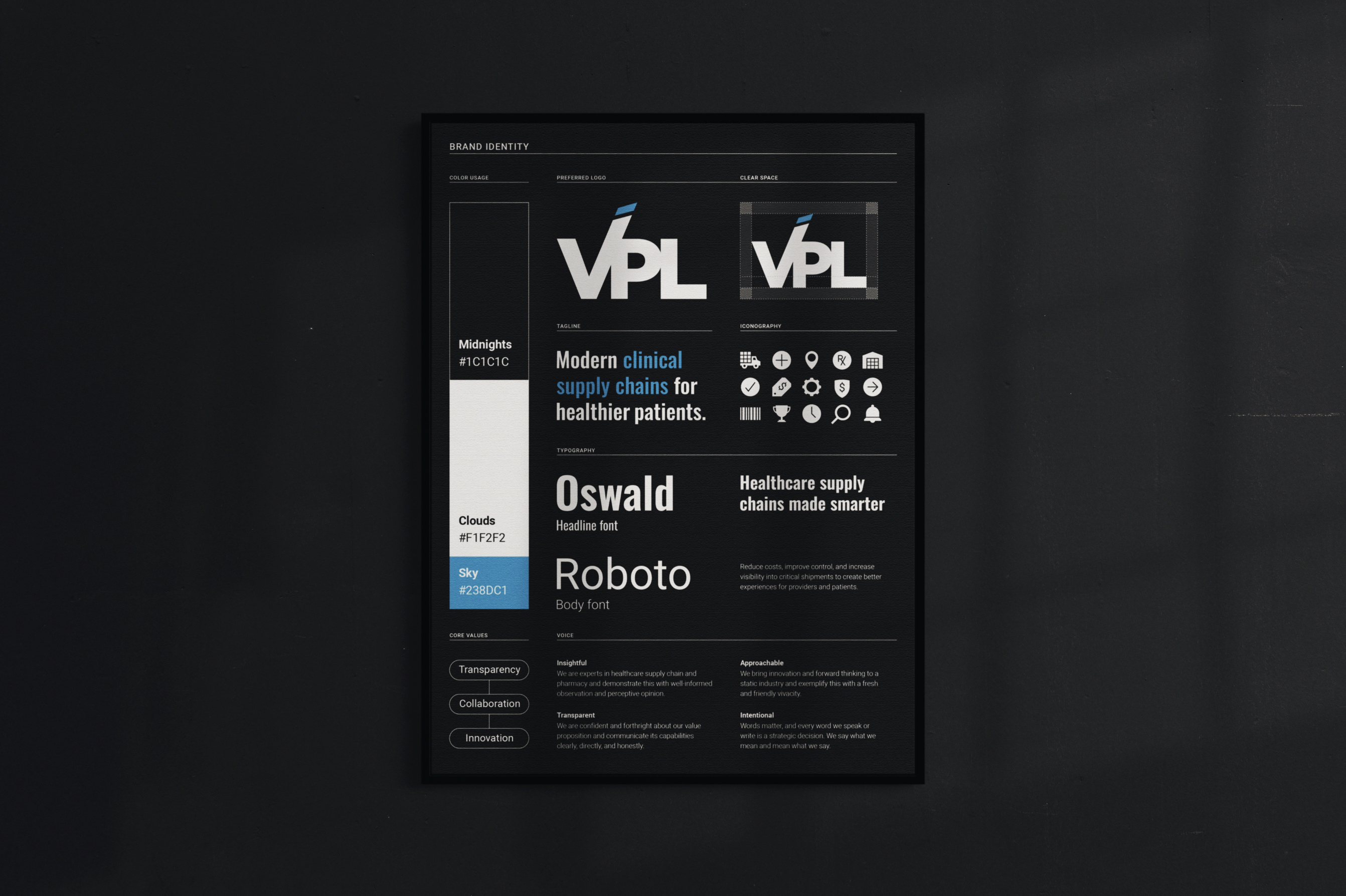
We’re excited to embark on our next chapter where there’s infinite opportunities in monochrome and where sky blue serves as our north star towards excellence!
About VPL
We modernize clinical supply chains to support healthier patients. Our technology-driven solutions and consultative customer experience empower health systems and outpatient pharmacies to build smarter, more resilient supply chains. With over 700 hospitals and a 97% customer retention rate, we’re trusted to deliver transparency, cost savings, and peace of mind.